Translation missing: en.landing.space_planning.placement.block_0.title
Translation missing: en.landing.space_planning.placement.block_0.text GET A ROOM
How to use this page?
Each component is divided by 1px orange border at the top and at the bottom of the component to clearly identify components's size.
There is a code block with full component functionality provided before rendered component.
component-hero snippetHero is a reusable, flexible component for showcasing hero unit style content. It is extended to the entire viewport on only one side to showcase key marketing messages with style. In some cases creative requires only two breakpoints. By default, three breakpoints are supported, but only two could be set as well, just add componentClass: 'medium-down-large-up-only'.
|
You are able to pass custom class and id names to both component and button inside of the component via:
|
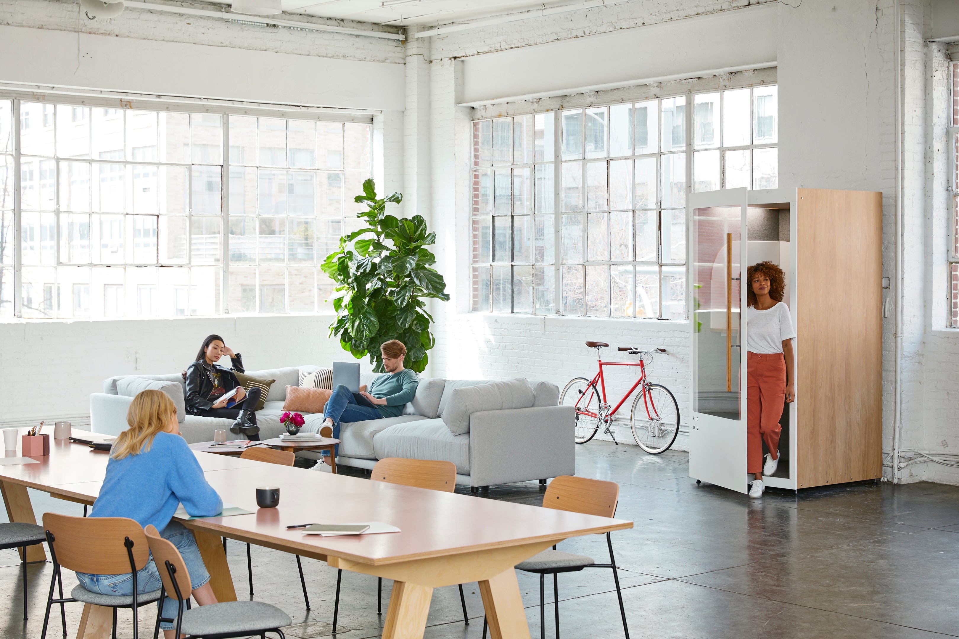
Our modular rooms create a happier, more productive workplace. Find out how many booths you need to create the ideal space for your workforce.
component-hero-text snippetText Hero is a reusable, flexible component for showcasing hero with only text.
|
You are able to pass custom class and id names to both component and button inside of the component via:
|
component-text-image snippetUsed for displaying image on the left and text on the right.
|
Translation missing: en.landing.space_planning.placement.block_0.text GET A ROOM
You're able to include this component in a loop, that's useful for displaying left / right content. For example:
|
Translation missing: en.landing.space_planning.placement.block_0.text GET A ROOM
Generally speaking, the more crowded an area, the higher the noise level. Our phone booths are best situated in close proximity to where they're needed most. They can create space for focused work and private calls in heavily trafficked areas, or create space for important conversations in quiet areas. GET A ROOM
Promote proper use by ensuring team members use phone booths for one-hour time blocks or less. Make sure you have enough booths throughout the space so they're available to anyone who needs to pop in for a quick work session. GET A ROOM
component-three-up snippetThree up is a reusable, flexible component.
|
You are able to pass custom class and id names to both component and button inside of the component via:
|
Our modular rooms create a happier, more productive workplace. Find out how many booths you need to create the ideal space for your workforce.
Our modular rooms create a happier, more productive workplace. Find out how many booths you need to create the ideal space for your workforce.
Our modular rooms create a happier, more productive workplace. Find out how many booths you need to create the ideal space for your workforce.
component-three-down snippetThree down is a reusable, flexible component.
|
You are able to pass custom class and id names to both component and button inside of the component via:
|
component-text snippetLeave out the buttonLabel & buttonHref to not include CTA.
text variable needs to include <mark> and </mark> in order to make part of the text black.
|
|
component-text-two-column snippet
|
component-image snippet
|
A ROOM representative will reach out soon via email. Feel free to take a look around while you wait.
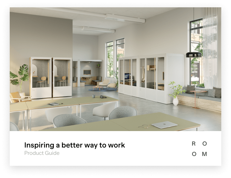
CloseDiscover our suite of modular products designed to help businesses return to a better way of working.
We’ve sent our Product Guide directly to your inbox. You can expect to receive an email from us in the next couple of minutes. Feel free to take a look around while you wait.